Mindler is India’s leading career counselling platform, helping school and college students find the right path through expert guidance and assessments.
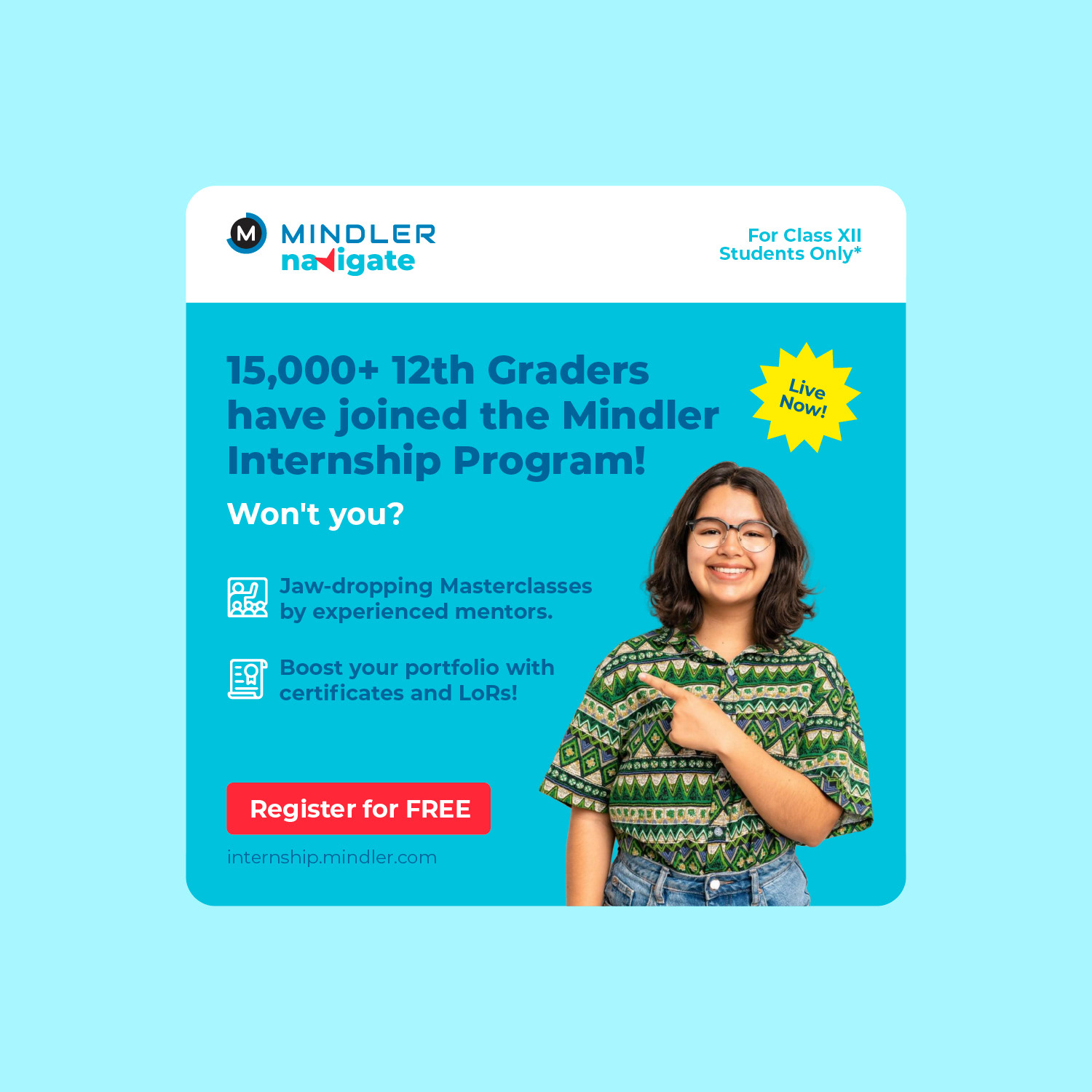
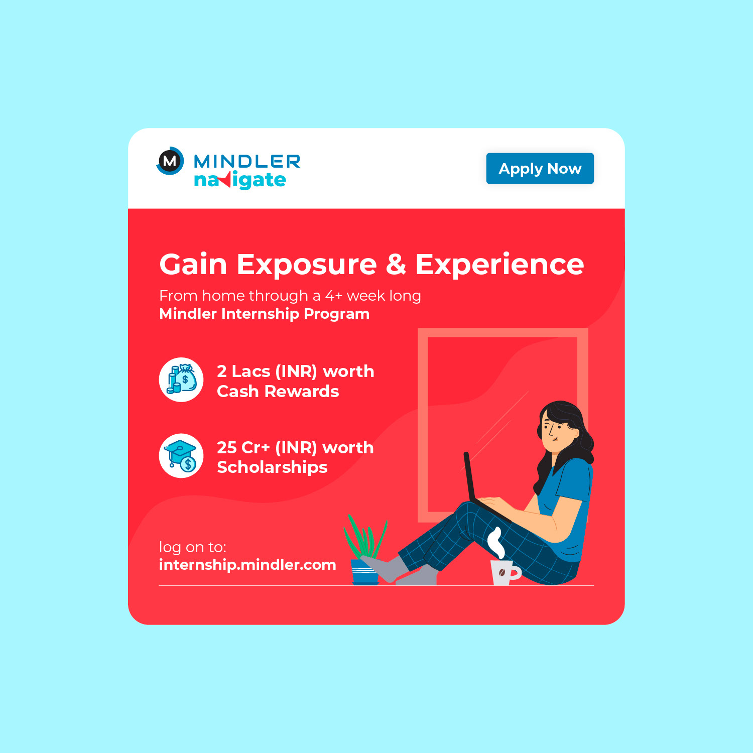
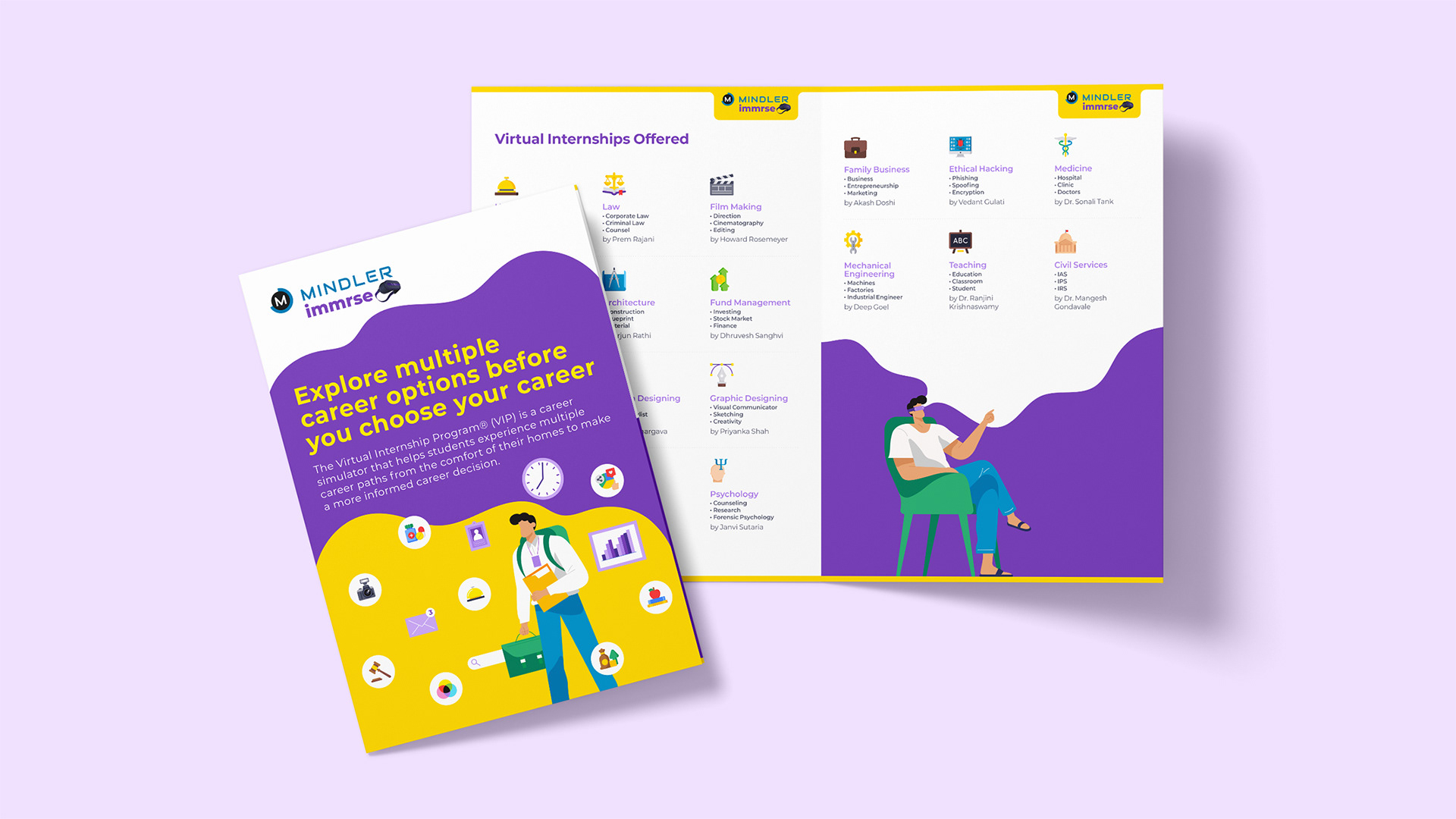
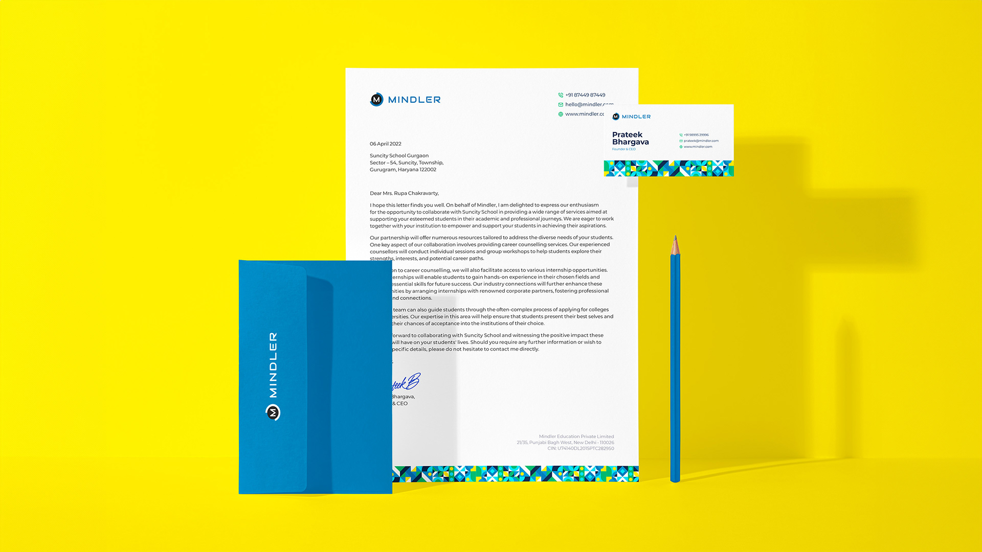
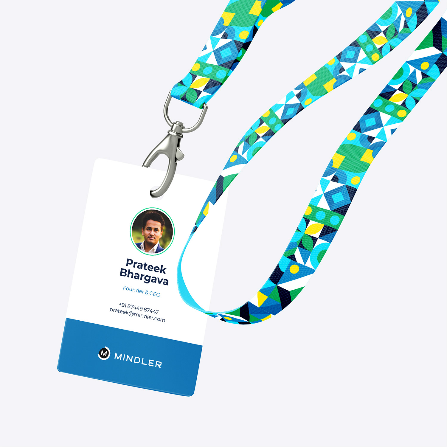
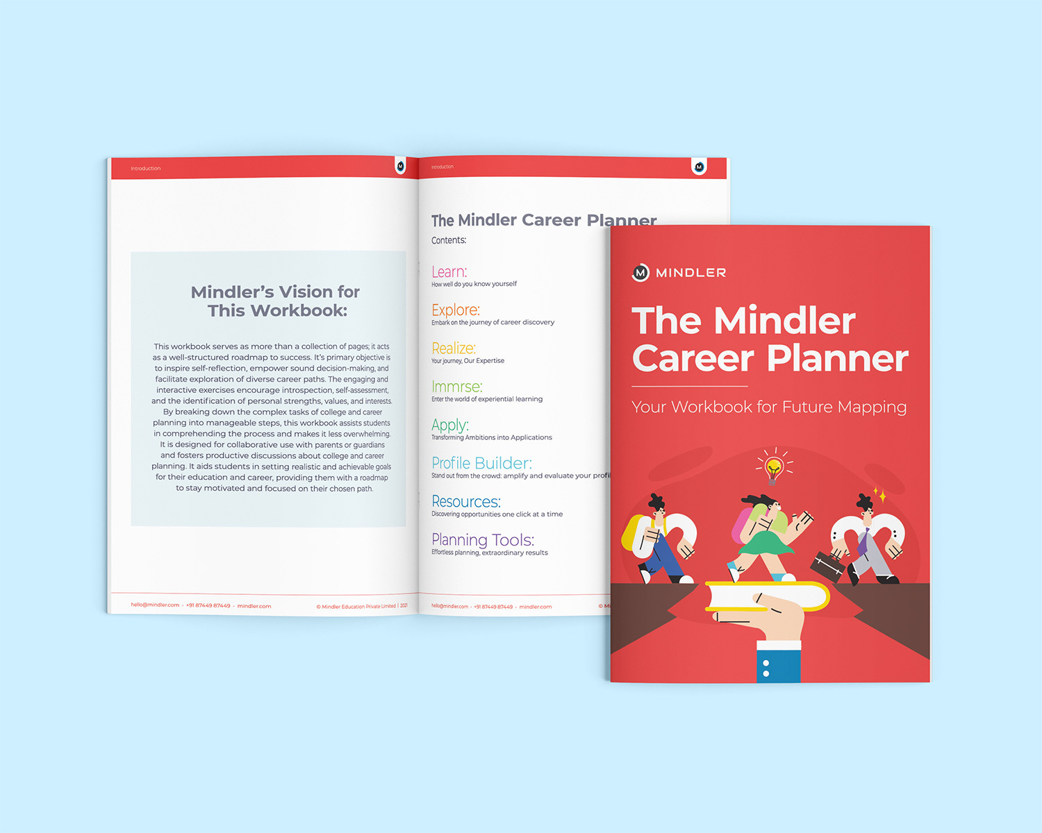
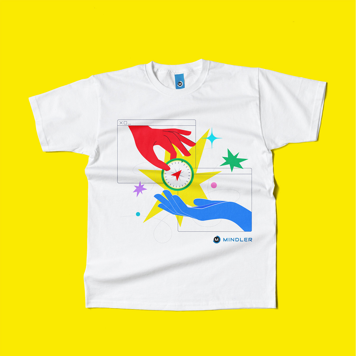
They brought me on to create a clear and consistent design system across all their materials. I refreshed the brand using bright colours and playful illustrations to make it feel more engaging. The typography was standardised for consistency across print and digital. As the company grew, I developed a colour system to help new sub-brands feel connected to the main brand while still standing out on their own.

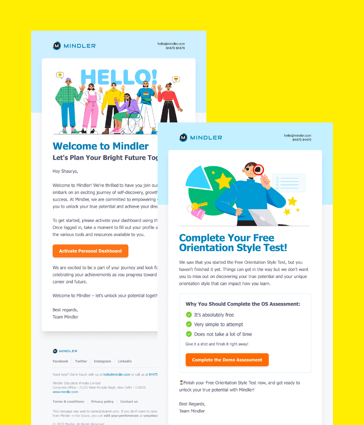
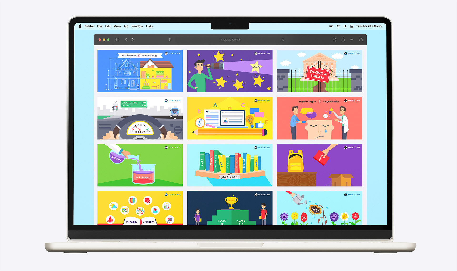
↑ Mindler's existing collaterals ↑
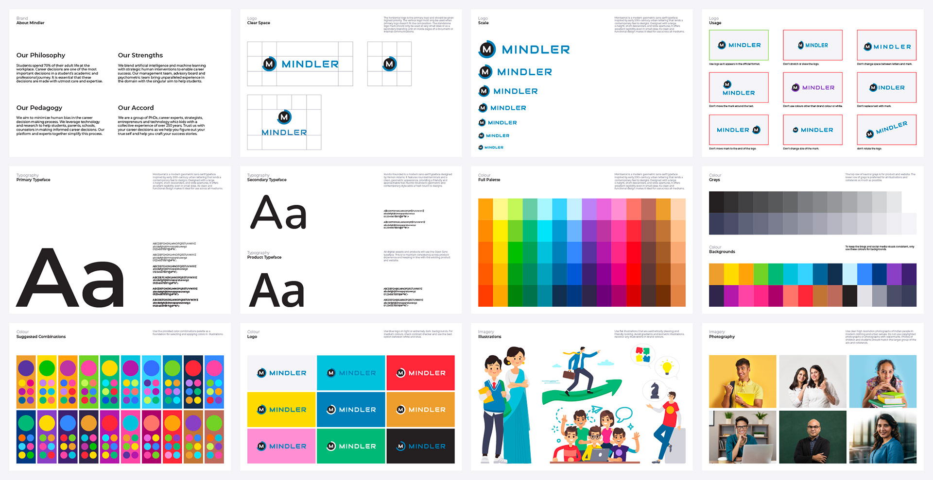
Mindler’s existing materials lacked consistency, with mismatched colours, fonts, and logo variations across platforms. I cleaned this up by standardising the logo, creating a new colour palette, and building a clear visual guide.

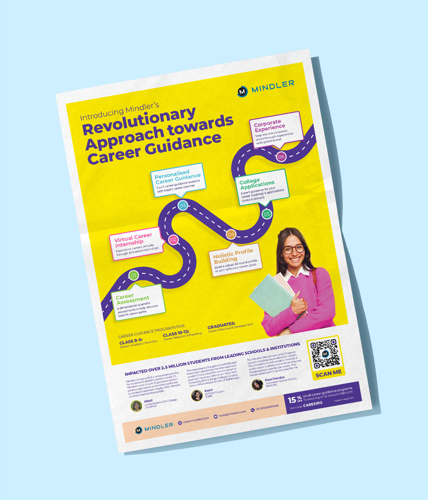
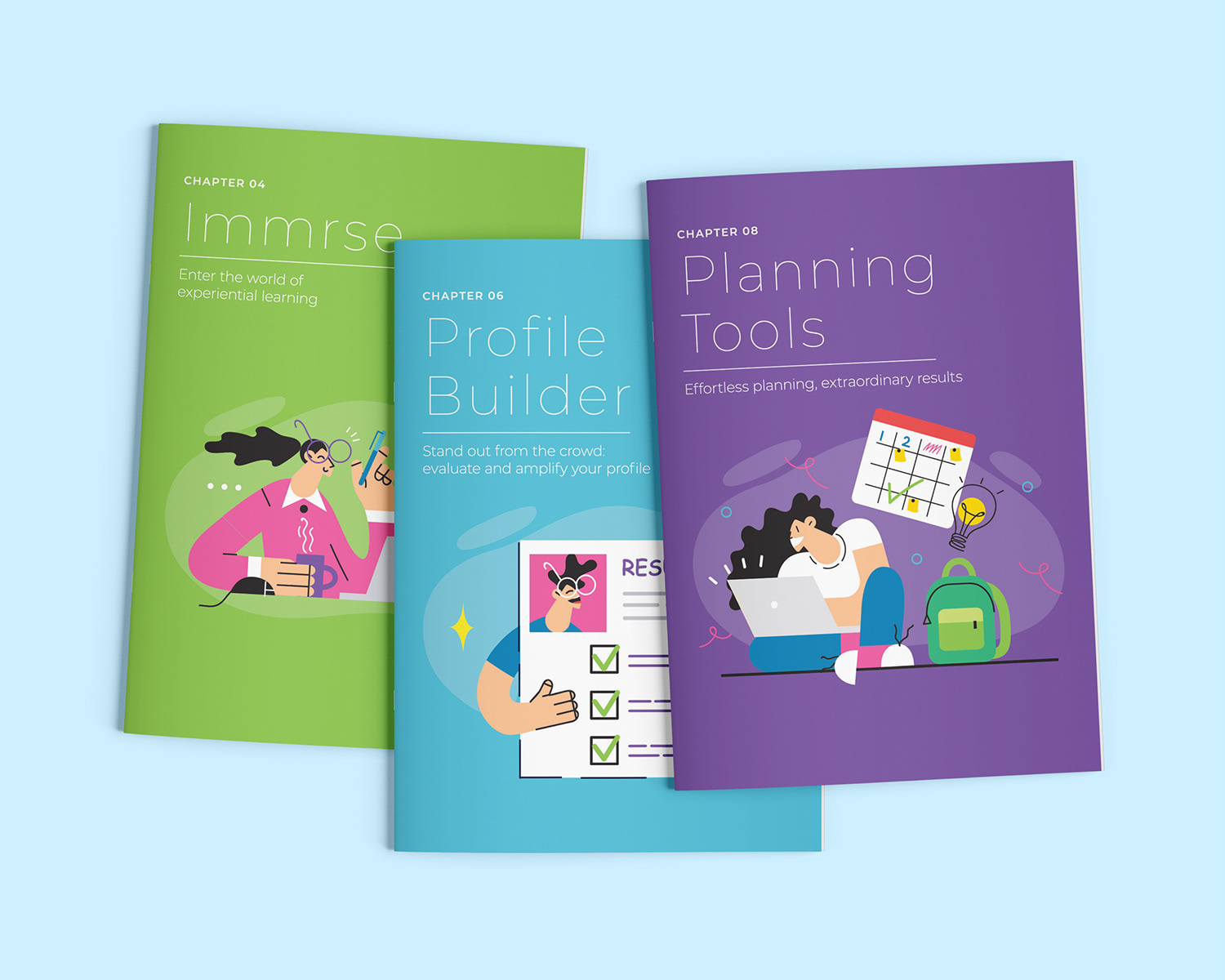


As the company expanded into different verticals, each with its own audience and needs, I developed a system to keep the branding cohesive. Each sub-brand followed the core design language but used its own colour to stay distinct while still feeling part of the larger brand.